Friday, September 24, 2010

Money-Minded

When I'm given a lot of leash in assignments, my tendency is to subscribe to one of three approaches: morbidity, humor, or morbid humor (my favorite). I'm not sure which of those this currency redesigning project is falling under.

I began thinking about not just our currency in it's physical sense, but our country's wealth and how it came to be. Conclusively, we are primarily a nation built on the resources and labor of other peoples. I understand that now our pieces of paper are really more of an idea based on "trust" and that the wealth doesn't necessarily exist in the same state it once did, but I don't think I'm going to touch that issue with this. Seems unfruitful.

I'd like to redesign our currency with a particular dark frankness.

Instead of presidents or political leaders or thinkers, there will be images of workers from other countries or images representing the U.S.'s major industries. For example, there will be one bill about the oil industry. The hard part of this is choosing which people and which industries to represent. We've been all over the place this past century. Grief.

This is the first I've done:
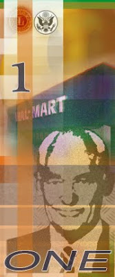

It's rather jolly so far, but I'd I'm considering putting the quote by Sam Walton on the front: "I pay low wages. I can take advantage of that. We are going to be successful..." But I feel like I could find something more deeply sinister. In general, I feel it needs more text anyway. On the back, which doesn't exist yet, I'm considering having images of George Pullman to compare the two men and the similarity of their business models.

This project is eating up my time in one yummy chomp. At least I'm enjoying it.

Friday, September 17, 2010

Brushin' Up on CS5

I like how this first one came out, but really, it just made my hands ache to hold a brush and feel the material of the paint under my physical control as opposed to my will alone. It doesn't help that my roommate has been joyously painting away on three 7-foot canvases every time I come home.

The ache to paint is like the ache to hug. But the hugging ache seems to be experienced more in the pectoral/bicep region of the body and my painting ache occurs in my forearms and wrists. And, of course, both affect my chest.

This is from a photo of an uncle teaching the guitar to a cousin of mine at a family picnic in the '60s.


I had a hard time know which brushes to use for the textured aspects of this one. I dig the clouds, though.


And here are a couple of lighting edits I did. The top images are the altered ones. That second one is a doozy. Watch your step.


Sunday, September 12, 2010

Postcardia III

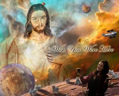
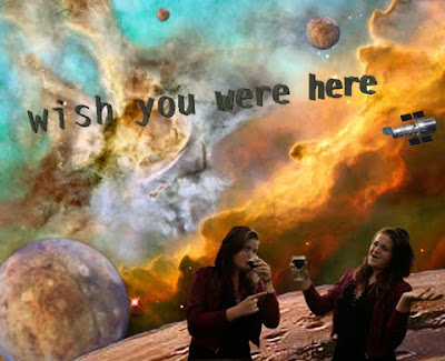
Here are some postcards about what I would do if I went to outer space. Obviously.


Postcardia II

Jesus (including the pre-concieved art history understanding of Jesus), puppies, and outer space; these are three of my favorite things.

The space environment was actually the most complicated endeavor of these two. It's seamed from 3 different Hubble images and then I played around with the clone stamp on a low opacity, sort of using it as one would a paint brush to blend.

Friday, September 10, 2010

Postcardia


This is the first of my postcards. There are more. But blogger.com refuses to upload them.

Also, this one isn't 5 x 7, I just wanted to get an image on here to perhaps get some feedback. I will post all of them together in due time.

I spend too much time alone in my apartment. And this is pretty much what it's like. Also, I think the image of the school sort of acts as a stand-in for the academic art world. And I could be seen as a representative of that community, as well, having discourse with myself, maybe about art because I'm in front of an art school...and that's how I feel about Modernism.

And sometimes Po-Mo.


I'm extremely frustrated with this photo-loading issue.